In a retail store, layout isn’t just about improving navigation. It’s about optimizing your space for the products you want to sell and the experiences you want to create. You need to give customers room to explore your merchandise in the ways that make the most sense for each product category.
People don’t select groceries the same way they browse household items, toys, apparel, tools, furniture, or electronics. Each of these categories may require your store to adopt a different layout to facilitate the ideal shopping experience.
But modern stores are becoming more than a point of sale, too. Today’s retailers need to consider store layouts that incorporate alternative distribution models like local delivery, curbside pickup, and buy online pick-up in-store (BOPIS). These purchasing methods require stores to allocate space in different ways, and may significantly change a retailer’s floor plan.
To help you discover the optimal layout for your store, we’ve pulled together six of the main store layout models, as well as some key elements that make a layout effective.
1. Grid layout
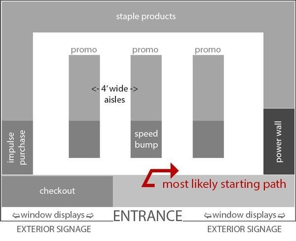
When you want aisle after aisle of products packed wall-to-wall, you need a grid layout. This store layout is a staple of grocery stores and a core component of some retail departments. It’s familiar, and it makes it easy to organize products in intuitive, browsable arrangements.
Consumers are used to navigating densely packed shelves in a grid layout to find the items they need, and end caps offer prominent locations to highlight special promotions and products you want to call attention to.
The key advantages of grid layouts are its ample display space, familiarity to consumers, and the ability to control and optimize traffic flow.
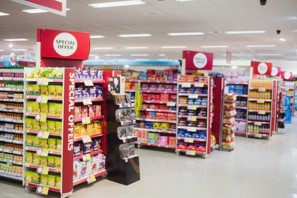
For stores with thousands of SKUs, it’s hard to find another organizational system that provides a dedicated space for each item. And since people encounter grid layouts all the time, someone who has never set foot in your store before can easily start to find their way around. They’ve been trained to walk along the aisles and look up for signage until they find the right section, shelf, and selection.
As people get accustomed to your specific use of the grid layout, they learn to find the shortest paths to what they need or a path that takes them through the other aisles they need to grab items from. People expect grid layouts to remain static, and any changes can be disruptive to existing customers. But a grid layout is ultimately only as good as your organization system. You need clear signage and intuitive product groupings to maximize the utility of this design and prevent frustration.
By putting your highest-demand items at the back of the store, you maximize the opportunities customers have to make impulse purchases and see important promotions. There are a finite number of paths to these items, and you can ensure that each major pathway includes items people are most likely to buy on a whim.
Ironically, some of the biggest advantages of grid layouts can also become weaknesses. Endless rows of densely packed products can easily feel overwhelming, particularly to someone who isn’t familiar with your store. And while signage can help remedy this, it can still be frustrating to weave in and out of busy aisles to get across the store to the section you need. Even the layout’s familiarity has another side: if you don’t create excellent experiences in other areas, your layout can make your store forgettable. There are a million other stores just like it.
Throughout the COVID-19 pandemic, many retailers widened their aisles and placed more clear wayfinding signage around the store. This decreased room for merchandise, but it also helped relieve another common challenge grid layouts present: narrow aisles make it difficult to pass another shopper without bumping into them. Some customers will leave the store rather than face crowded walkways, especially after someone steps on their toes.
Optimizing a grid store layout requires you to think not only about how to cram your entire catalog onto the shelves, but how to ensure your customers have a smooth, bump-free browsing experience.
2. Herringbone layout
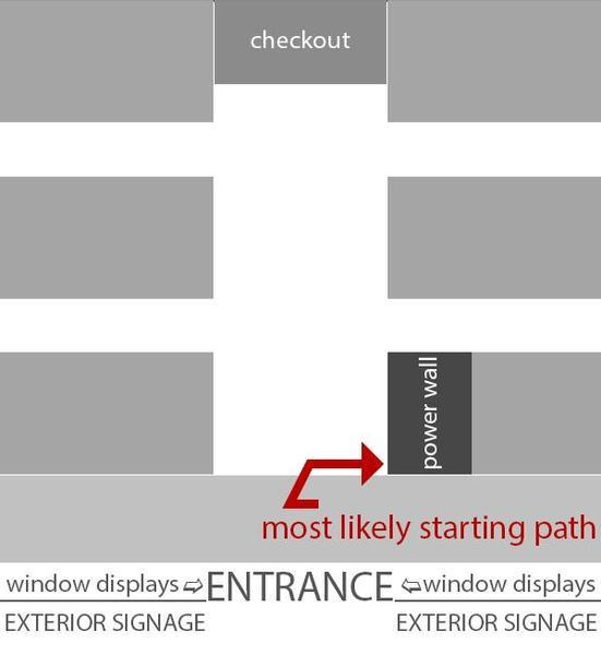
A herringbone layout is essentially a variant of a grid layout, best suited for smaller spaces. The biggest difference is that there’s essentially only one pathway for browsing the store. Customers come in one end and checkout at the other, and between those two points are tightly packed aisles of products. A single main walkway runs between the entrance and checkout.
The advantage of this model is that you can still create plenty of display space, and as with the grid layout, it’s intuitive and simple to navigate–so long as you’ve organized your products well. However, since a herringbone layout is most often used in stores with a large number of SKUs and limited floor space, it tends to amplify one of the major challenges with grid layouts: it can make a small space feel even more cramped.
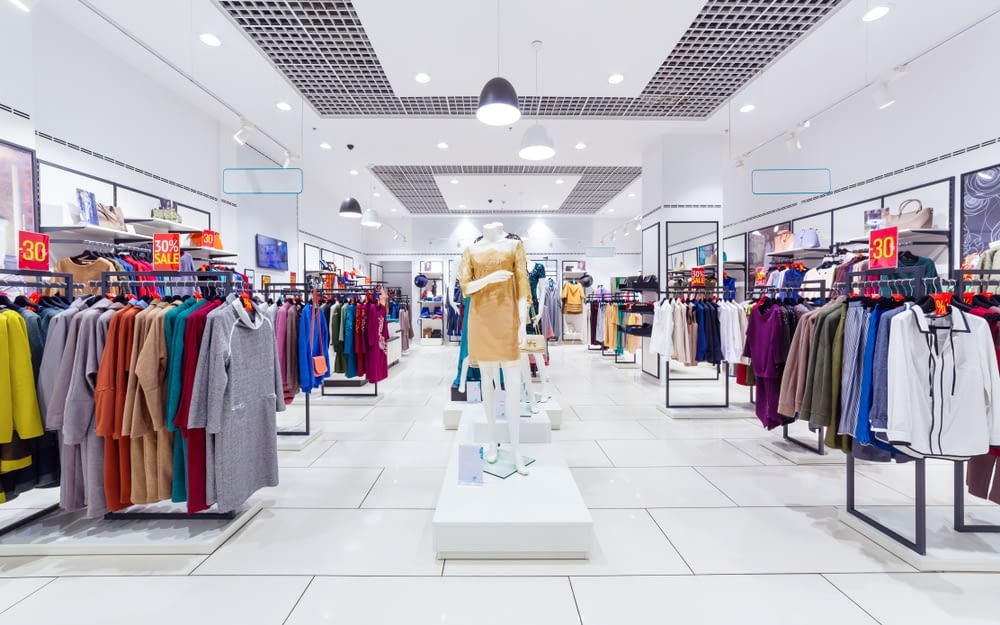
The herringbone layout also introduces a new problem: visibility. Particularly in small stores with a limited staff, it can be difficult to monitor the store’s entrance from the cash register. It’s easier for people to slip out the door with merchandise because the cashier is across the building. Technology can obviously help remedy this issue, but it’s a problem you’re less likely to experience when customers check out near the same place they enter and exit the store.
3. Loop layout
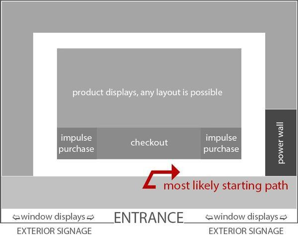
A loop layout is just like it sounds. It’s a circuit that loops around your entire store, with merchandise displayed in the center and outer edges. When customers enter the store, they can go left or right, and that’s it. The path is fixed, which gives you maximum control over how customers experience your offerings.
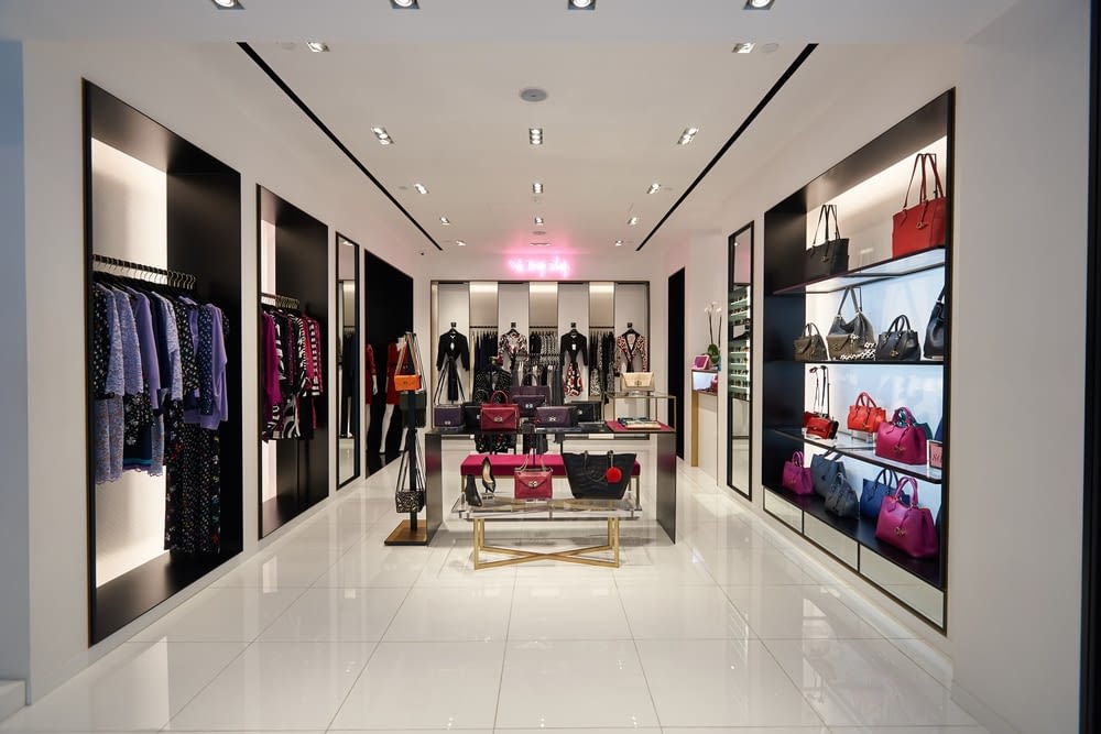
While a loop layout doesn’t give you the kind of display space you get with a grid layout, the fixed path ensures that your customers will be exposed to a large percentage of your catalog, and it gives you the freedom to create a variety of experiences with the distinct sections of your store. For example, your loop could be like a series of showrooms, where people can see your products in a more natural environment and get inspiration for their own settings.
The long path through the store works well for leisurely browsing, but customers who already know what they want will find it frustrating to work through the loop for a specific item.
4. Free-flow layout
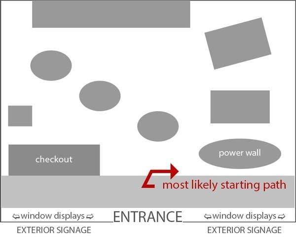
A free-flow store layout gives retailers the creative license to design a greater range of experiences. It isn’t driven by an intent to maximize display space or drive customers toward specific pathways. In fact, a free-flow layout has no defined pathways, and customers can maneuver around displays and through departments however they like.
Having more paths through the store means there’s significantly more open space, and the presence of other customers is less disruptive to each person’s individual shopping experience. You can always go around someone, and you’re far less likely to get stepped on.
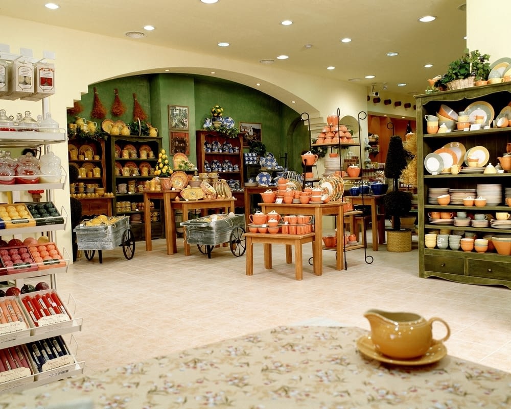
Giving each product so much space obviously means you can’t have as many products on the floor, but it can also make it easier for customers to discover new products and make impulse purchases. You also have more freedom to incorporate visual breaks in the browsing experience.
The success of this model largely depends on how well you organize your products and provide signage. The free-flow layout lets customers choose their own path, but if they don’t know where to go, people can easily feel lost. The larger your space, the harder it is to make a free-flow layout feel manageable.
5. Omnichannel layout
Retailers that want to facilitate alternative buying experiences need to think about their store layout in completely different ways. You can’t simply tack on BOPIS, delivery, or curbside pickup to your current floor plan. Each of these requires an intentional, dedicated space.
If your BOPIS customers have to wait in line with everyone else waiting for customer service, they may not use BOPIS again. For some, the convenience of saving time shopping via BOPIS will be outweighed by the unpredictability of picking up their items. They’re just waiting to grab things they’ve already paid for, and there are multiple solutions for streamlining that experience.
You may want lockers so they can pick up their purchase without waiting on an employee or standing in line. Or you may want a dedicated counter so employees can focus on quickly serving these customers.
BOPIS customers also frequently make additional purchases upon arriving at the store–grabbing products that catch their eye or that they may have forgotten to include in their online order. This makes your in-store pickup counter a great place to create impulse buying opportunities around, allocating more space for this particular experience.
You might also start implementing delivery from your store location. While it’s tempting to think you can simply facilitate a delivery experience directly from your warehouse, it’s important to consider how this might interfere with your other processes. How will delivery trucks work with your current traffic flow in and out of the warehouse?
Depending on how much of your business comes from these alternative fulfillment methods, you may need to completely reimagine your store. Walmart has already firmly embraced the omnichannel model, transforming their stores into fulfillment centers.

Over the course of 2020, Albertsons saw store pickup increase by 1,000 percent, and they expect to facilitate this fulfillment method in 90 percent of their stores by the end of 2021. COVID obviously had a huge impact on the adoption of alternative fulfillment options as consumers sought to avoid in-person shopping, and some of that growth is sure to persist.
Want to learn more about post-COVID consumer behavior? Download our free ebook, The Post-COVID Consumer: Preparing for a New Era of Shopping. In it, you’ll find a helpful exploration of how behaviors that emerged and accelerated through the pandemic will likely play out in the coming years, how stores are doubling down on these changes, and why you should wait before making sweeping changes.
Want to learn more about post-COVID consumer behavior? Download our free ebook, The Post-COVID Consumer: Preparing for a New Era of Shopping. In it, you’ll find a helpful exploration of how behaviors that emerged and accelerated through the pandemic will likely play out in the coming years, how stores are doubling down on these changes, and why you should wait before making sweeping changes.
6. Mixed layout
Depending on your industry and brand, you may find that no one store layout perfectly fits your catalog or the kind of experience you want customers to have. Maybe you have thousands of SKUs you need to display, but some of your product categories deserve a dedicated showroom. Or you want separate spaces to invite curiosity and encourage imagination.
If you have the room to create multiple types of spaces and displays, it can be helpful to utilize aspects of different layouts to create browsing experiences that fit each category. For example, if a store has grocery items, electronics, apparel, and furniture, you may want a combination of a grid and loop layout, or grid and free flow.
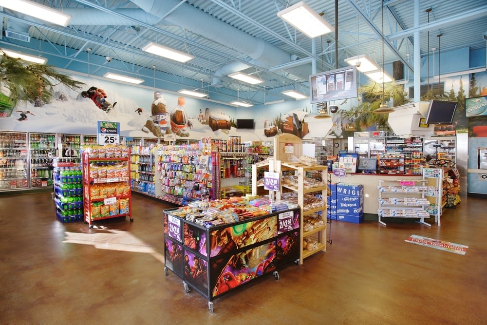
The challenge with a mixed layout is avoiding systems that create confusion. You don’t want someone to start a loop or wander free-flow displays expecting to find a product category, only to learn that it’s on a shelf across the store. And the inverse is true, too. The trick is to arrange your space based on the most intuitive, helpful ways to browse and evaluate your products.
Elements of an effective store layout
Creating an ideal store layout isn’t simply a matter of choosing the right model to follow. It’s also important to consider the specific kinds of spaces that will make your layout intuitive and effective. There are techniques and choices that work with most layouts and impact how customers experience and interact with your space. Understanding the purpose and value of these elements will help ensure you place and plan for them appropriately.
Strategic power walls
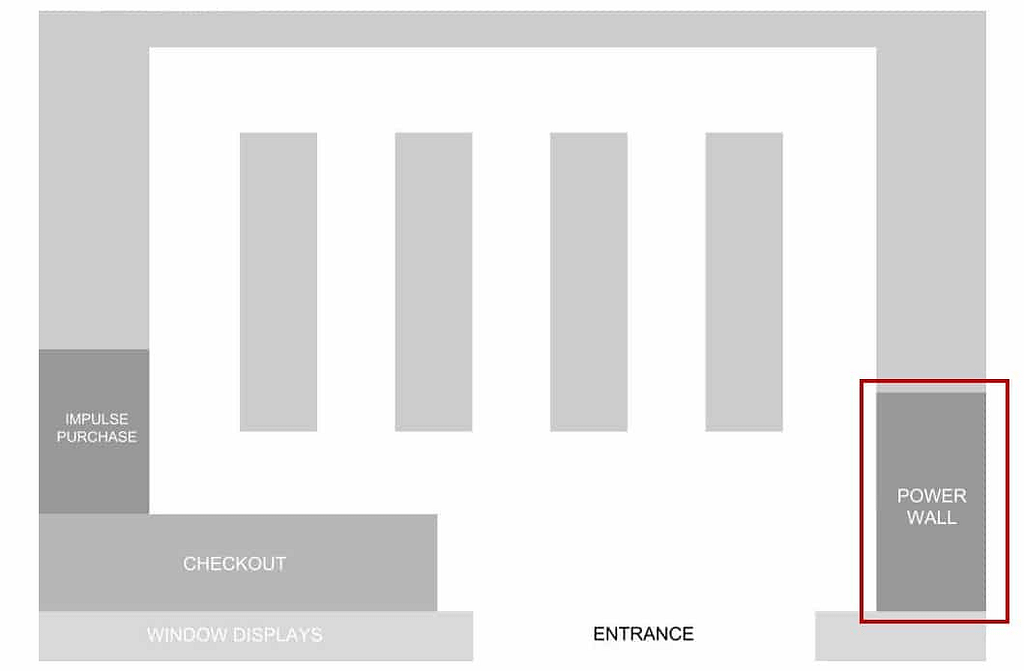
Most people turn right when they walk into a store. This is a psychological principle with huge ramifications for design and retail. Likely a result of most people being right-handed and how architecture has taught people to navigate spaces, this principle is known as “the invariant right” or simply “the right turn preference,” it’s led retailers to dub the right-hand wall the “power wall.”
In light of the invariant right, the power wall is the display you can be most confident that most of your customers will encounter. Unless someone arrives with an agenda that drives them to the left or center, they’ll likely default to that right-hand wall. And that means you need to think strategically about what you place here and how you present it.
There’s no one correct way to use a power wall. ]This could be where you promote high-demand items that fly off the shelves. Or a special promotion you’ve been advertising, which people will come to your store in search of. It could also be seasonal items, impulse purchases, or private label products. Whatever you want to prioritize and call attention to, this is where it needs to live.
Decompression zones
Whichever layout you choose, it’s important to allocate space for decompression zones. These are the spaces just inside your entrance where customers get oriented and figure out where they’re heading. Decompression zones are all about giving your customers breathing room to transition from the outside world and adjust to the pace of your store.
Entrances are already high traffic areas. You don’t want to add to that traffic by trying to cram this space with hot items. Ideally, you want to make this a good location to get the lay of the land, so customers can feel confident they’re in the right place and heading in the right direction.
Additional inventory space
The explosion of demand for alternative fulfillment options like BOPIS, BOSS, curbside pickup, and local delivery means that modern retailers have to allocate more space for inventory. In fact, the commercial real estate firm JLL predicts that by 2025, retailers will collectively need an additional one billion square feet to accommodate the growth of online sales.
Regardless of how your layout affects the balance between display space and room for inventory, you’ll have to consider the impact of omnichannel retail.
Impulse purchase areas
Whatever your catalog looks like, there will always be items someone is more likely to purchase on a whim. Products that catch the eye, trigger cravings, or complement nearby high-demand items. To maximize the utility of these displays, impulse purchases should be placed in high traffic areas where you know people are going to encounter them en route to your staple products and the most in-demand items.
Smooth traffic flow]
Congestion kills sales. When customers feel like they can’t move in your store without crashing into carts or running into other shoppers, that directly contributes to their perception of your store and their experience within it. Long lines can evoke similar frustrations. So it’s important to balance your need for display space with your customers’ need for clear pathways and smooth sailing. In every aisle, think about how it will feel to have various combinations of carts, strollers, baskets, wheelchairs, and motorized shopping carts trying to maneuver past each other.
Well-placed seating
Some spaces and products are best accompanied by seating. Benches to try on shoes or sit while waiting for someone to change, go to the bathroom, or pick up a prescription. It’s important to consider the parts of your store where someone may need to stand for a while or walk for an extended period, and find appropriate places to give their legs a break.
Helping customers feel comfortable in your store ensures that their shopping experience won’t be cut short by fatigue or impatience, and encourages them to come back the next time they need something.
Is your store ready for the future of retail?
When it comes to preparing for the future, modern retail stores are in a difficult position. Shopping will never be like it was before COVID. And it won’t be like it was during the pandemic, either. In this industry, so much depends upon the predictions you make from historical data. But we’re in a new era of shopping, and your store layout should reflect that.
Retailers that want to thrive and compete in a post-COVID world need to reorient, recalibrate, and reposition their stores. To help you do just that, we’ve created a free suite of resources exploring the current state of retail, how retailers around the world are adapting, and what you can do to get and stay on top.
We call it Location Is Everything. You’ll find articles, webinars, videos and more that you’ll want to refer to in your next meeting and consider as you plan the road ahead.
Check it out.